
 V for Vendetta. Rating : ***** ***** (out of 10*).
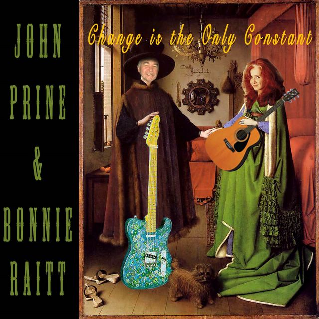
If you like books/movies such as Fahrenheit 451, Brave New World and 1984, you're going to love this movie. It's set in London, but has major relevance to the USA as well. No reason to give away anything about the plot, except to say there's one scene where you get to see my favorite painting - 'The Betrothal of the Arnolfini'. If you aren't familiar with this masterpiece, see my final Photoshop project (below).
I really can't think of anything wrong with this movie. And you can be pretty certain that Tony Bliar and Dubnutz don't want you to see this one.
Oh yeah, 'Pirates of the Caribbean 2' is coming out this summer. It'll probably be the next movie I go see in a theater.
V for Vendetta. Rating : ***** ***** (out of 10*).
If you like books/movies such as Fahrenheit 451, Brave New World and 1984, you're going to love this movie. It's set in London, but has major relevance to the USA as well. No reason to give away anything about the plot, except to say there's one scene where you get to see my favorite painting - 'The Betrothal of the Arnolfini'. If you aren't familiar with this masterpiece, see my final Photoshop project (below).
I really can't think of anything wrong with this movie. And you can be pretty certain that Tony Bliar and Dubnutz don't want you to see this one.
Oh yeah, 'Pirates of the Caribbean 2' is coming out this summer. It'll probably be the next movie I go see in a theater.
Sunday, March 26, 2006
This Weekend I Saw...
V for Vendetta. Rating : ***** ***** (out of 10*).
If you like books/movies such as Fahrenheit 451, Brave New World and 1984, you're going to love this movie. It's set in London, but has major relevance to the USA as well. No reason to give away anything about the plot, except to say there's one scene where you get to see my favorite painting - 'The Betrothal of the Arnolfini'. If you aren't familiar with this masterpiece, see my final Photoshop project (below).
I really can't think of anything wrong with this movie. And you can be pretty certain that Tony Bliar and Dubnutz don't want you to see this one.
Oh yeah, 'Pirates of the Caribbean 2' is coming out this summer. It'll probably be the next movie I go see in a theater.

Tuesday, March 21, 2006
This Week I'm Listening To...
 Massive Attack : "Mezzanine". (1998) Rating : ***** *½ (out of 10*)
The group (and album) that spawned a new music genre : "Trip Hop". Nice, moody, carefully-arranged tracks. The third cut, "Teardrop", was deservedly featured on a recent Cold Case episode. However, the mixing leaves a bit to be desired. Sometimes the music volume is just too low. So you crank it up, only to be blasted when the music switches into a louder mode. The vocals are similarly up-&-down. Still, this is definitely an album worth listening to. To quote Jason, "Good from beginning to end".
Massive Attack : "Mezzanine". (1998) Rating : ***** *½ (out of 10*)
The group (and album) that spawned a new music genre : "Trip Hop". Nice, moody, carefully-arranged tracks. The third cut, "Teardrop", was deservedly featured on a recent Cold Case episode. However, the mixing leaves a bit to be desired. Sometimes the music volume is just too low. So you crank it up, only to be blasted when the music switches into a louder mode. The vocals are similarly up-&-down. Still, this is definitely an album worth listening to. To quote Jason, "Good from beginning to end".
Thursday, March 09, 2006
This Week I'm Listening To...
 EPICA : THE PHANTOM AGONY. Rating : ***** *** (out of 10*)
Another fine European Goth Metal band, this time out of Holland. Yeah, there's the standard female lead singer, and the grunting male vocalist. But what makes this band worth listening to is their excellent operatic arrangements. If you like Within Temptation, Nightwish, and Ashtar (and Ashtar and Epica played at least one venue together last year); you'll love Epica. Tell your folks that you're finally getting into Opera.
EPICA : THE PHANTOM AGONY. Rating : ***** *** (out of 10*)
Another fine European Goth Metal band, this time out of Holland. Yeah, there's the standard female lead singer, and the grunting male vocalist. But what makes this band worth listening to is their excellent operatic arrangements. If you like Within Temptation, Nightwish, and Ashtar (and Ashtar and Epica played at least one venue together last year); you'll love Epica. Tell your folks that you're finally getting into Opera.
Wednesday, December 21, 2005

ART-177 Final Project : CD Cover
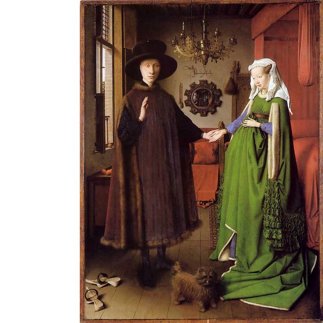
Final project above. Also shown is the original painting by Jan van Eyck, titled "The Betrothal of the Arnolfinis", done in 1434.
Assignment was to design a CD cover using Photoshop. You could choose any musician, singer, or group; but it had to be a real group, since you had to also submit a jpeg or photocopy of the group's previous CD covers as reference. I chose John Prine and Bonnie Raitt, who have never done a joint CD or album, but who have toured together several times.
The title of the ersatz CD was not of our choice. It had to be "Change Is The Only Constant", and the CD image had to in some way convey this title.
So let's see. I used layer masks like crazy in this image. John's head; Bonnie's head; the acoustic guitar; and the stratocaster guitar. All had to be re-sized and rotated. I had to drop Mr. Arnolfini's hand to the level of the guitar. I had to manipulate the fingers on that hand so that some were on top of the stratocaster and some were behind, in order to make it look like he was holding the guitar.
Both John's and Bonnie's heads needed to be tinted different from the original photos in order to make them look more convincing in the picture. John's face also needed a lot of shading since he's wearing that big hat. I finally figured out how to do this - by using the "burn" tool with the setting on "shadows". Well, I didn't figure it out, my prof did.
Mrs. Arnolfini's left hand had to be brought out over the acoustic guitar. The acoustic guitar in turn had to be positioned and sized just right in order to hide the lovey-dovey hand-holding of the Arnolfinis, and to appear to be resting on Bonnie's shoulder. The stratocaster had to be positioned in front of Mr. Arnolfini's boots, but behind the butt of the dog.
I found a good font for the names, and colored it close to Mrs. Arnolfini's dress. It's nice that Bonnie and John both have short last names, otherwise the left-panel positioning would not have worked.
Finding the right C0lor, Font, and Placement of the "Change Is The Only Constant" title was a lot more difficult. Font-style had to contrast the one used for the names. The placement seemed correct artistically, but that meant it runs thru a wide range of colors. I'm still not fully satisfied with the color and font, but both were chosen after trying many other combinations.
Final Grade for the project was 290 out of 300. Most of the classmates' critique centered on whether the image conveyed the "Change is the only Constant" theme. Van Eyck's painting is more famous than I had anticipated, and a lot of my classmates wanted to know if I was implying that John and Bonnie were in love and/or getting married. Alas, nothing as spicy as that. I chose van Eyck's painting simply because I thought it had great potential to be manipulated in Photoshop.
Lots more could be said about van Eyck's painting itself (which is fantastic!), but that'll have to wait for another entry. All in all, I'm quite happy with the project, and with the ART-177 class itself. Comments on the project are invited, and if you want to see some really professional image-manipulation, go to www.worth1000.com .
Subscribe to:
Posts (Atom)